Dan Murphy's
Revisiting and redesigning the Dan Murphy's App User Experience
/ STAKEHOLDER WORKSHOPS
/ USER RESEARCH
/ COMPARATIVE ANALYSIS
/ UX DESIGN

Overview
The Dan Murphy's Design team (now Endeavour X) had a key requirement was to revisit the existing Cart & Checkout experience on their Mobile App. There was an overall objective of enhancing and improving the current app user experience.
I was brought in on secondment from Wunderman Thompson as a dedicated UX resource to support the in-house Design and Dev teams with the ongoing App initiatives within Dan Murphy's.
SECTOR
Enterprise, Retail
TIMEFRAME
2019 -2020 (11 months)
MY ROLE
Senior User Experience Architect
1. Native Cart & Checkout Experience
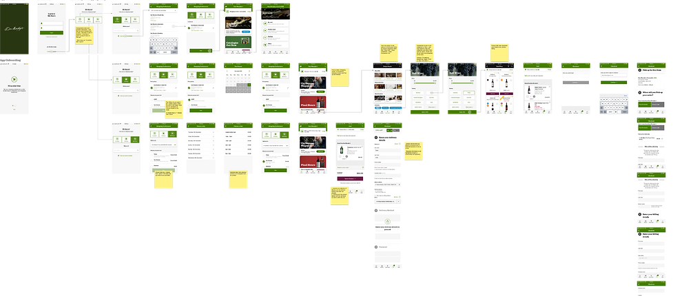
For the primary initiative, we began by building a shared understanding of the current issues and challenges of the Mobile App cart & checkout experience in collaboration with the key business partners. Following the initial kick-off, the UX and UI team carried out the following tasks:
Review of the existing flow and process
We carried out an end-to-end review of the existing cart & checkout flow and business processes in order to identify areas of improvement from an experience point of view. We also reviewed partner and competitor apps in terms of their checkout flows and processes in order to identify best and common practice.

Concept creation and validation
Following the reviews of the existing flows as well as the comparative analysis, we created wireframe concepts of the proposed variants of the onboarding and checkout flows for the App and ensured that these aligned to business processes. These concepts were then tested and validated with end users.

After successful validation with end users, the UI team produced the new designs for iOS and Android. We worked with the in-house Dev team in an Agile approach to ensure that the updated designs and flow for the cart & checkout was implemented in the App.
2. App Catalogue
Dan Murphy's were looking to phase out the physical paper-based product catalogue. The catalogue was already available in digital format through the Dan Murphy's website. As part of the upcoming initiatives, there was a requirement for the catalogue to be made available and accessible on the Dan Murphy's App.
Following the project kick-off, we created a conceptual design of the digital catalogue within the native App. There was also a technical spike carried out with the Dev team to determine the feasibility of incorporating the catalogue within the App. We subsequently tested and validated the conceptual design of the App Catalogue with end-users.
User testing of the concept design
Using the Lookback.io remote usability testing platform we observed, with end-users, the usage of the existing mobile website catalogue in conjunction with the concept designs.
From the research, we were able to understand and document the usability issues perceived as well as main requirements from the end-users point of view.

MVP of the App Catalogue
We took the learnings from the concept usability testing to develop the MVP version of the App Catalogue.
This version was successfully released into the Dan Murphy's App.


3. Homescreen and Products discovery
There was an overall objective of enhancing and improving the current App user experience by ensuring that the base native functionality is optimised. To feed into this objective several enhancement sub-initiatives were kicked off as follows:
Homescreen Redesign
The Homescreen on the existing version of the App provided the same generic content and promotions to every customer.
Working with the key stakeholders, we reframed the Homescreen strategy such that the content could be:
-
CMS driven
-
Personalised based on the customer's usage and behaviour within the App, and
-
Easily configurable in a modular design approach
Before redesign

After redesign

Products Discovery Redesign
There was a requirement to revisit and repurpose the existing “Drink Finder” functionality. The previous functionality prioritised the available products in terms of "Gifts", "Collections" or "Occasions" - which was deemed as confusing.
The UX team worked with the business stakeholders to redesign and simplify the discovery of the Dan Murphy's products by allowing a simple product category based browsing function that met user expectations.
Before redesign

After redesign


